Vivwoods AiPaper Technical Unboxing – A Digital Writing Surface Focused on Concentration, Material Quality and Precise Input
When Packaging Suddenly Reveals More About Technology Than Marketing Slides Ever Could
The Vivwoods AiPaper does not begin with the power button. The shipping carton already communicates surprisingly clearly what this device was designed for. The packaging feels sober, technical and entirely focused on protection. No oversized product graphics, no aggressive slogans, no overloaded visual presentation. Instead, stable cardboard construction, functional labels and clearly placed product information dominate the exterior.
That very first impression fits remarkably well with the actual character of the AiPaper. The device does not present itself as an entertainment platform, but as a professional work device for digital note-taking, document handling and focused writing.
Even the dimensions of the package immediately reveal that there is no small reading device hidden inside. The footprint is noticeably larger than ordinary mobile hardware. At the same time, the package has a certain density. No hollow feeling, no loose interior movement, no audible shifting during transport. The packaging feels compact and structurally solid.
An interesting detail appears on the product label. “AiPaper with W2” sits quietly on the carton and initially looks like an ordinary model designation, yet technically it already describes key characteristics of the device. Behind those abbreviations lies the combination of a large-format E-Paper display and precise stylus input. Exactly these technical details later determine writing feel, responsiveness and precision during everyday usage.
Or to put it differently:
“The real quality of professional hardware rarely hides inside large marketing headlines. It usually lives inside the quiet technical decisions.”
Protection Instead of Presentation – Why the Packaging Was Built Around Technical Logic
After opening the shipping box, a substantial foam protection structure appears first. Thick white protective blocks fully surround the actual product box and prevent movement inside the outer carton.
At first glance this may seem unspectacular, but with E-Ink hardware it carries enormous importance.
Electronic paper displays are, by design, among the more sensitive display technologies in the consumer market. While conventional screens often compensate mechanical stress relatively well, E-Ink panels react more sensitively to pressure points, torsion and heavy impacts. The reason lies in the special layered construction of the panel with microcapsulated pigments and sensitive substrate materials.
That is precisely why Vivwoods visibly prioritizes protection over decorative packaging elements.
The foam components fit precisely, offer substantial material thickness and prevent external pressure from transferring directly onto the device. Especially with large-format panels, this matters significantly because structural twisting becomes much more problematic than on smaller displays.
The entire packaging concept therefore communicates the impression of a technical work instrument rather than a short-lived lifestyle product.

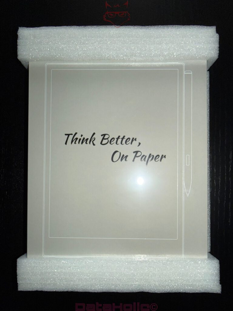
“Think Better, On Paper” – When Marketing Suddenly Gains Technical Meaning
Beneath the transport protection sits the actual product box. Gray, matte and remarkably restrained in its design language. Centered on the front appears the phrase: “Think Better, On Paper.”
Of course, this is marketing. Yet at the same time, the sentence describes the fundamental idea behind modern E-Paper devices with surprising accuracy.
The AiPaper does not attempt to imitate traditional screen hardware. The device follows a different objective entirely: digital information processing with minimal visual distraction.
That is exactly why E-Ink systems intentionally avoid many characteristics associated with modern entertainment electronics. No overloaded animations. No aggressive color rendering. No constantly flashing user interfaces. Instead, grayscale visuals, reduced menus and a heavy focus on readability dominate the experience.
The packaging communicates this philosophy consistently.
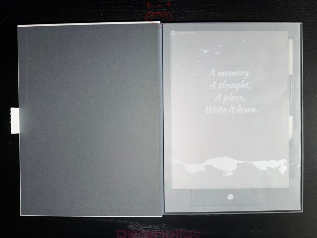
After opening the box, the AiPaper appears beneath a translucent protective sheet. Printed on top:
“A memory,
A thought,
A place,
Write it down.”
At first, the statement almost sounds poetic, yet within the context of E-Ink hardware it gains surprisingly technical relevance. Devices like this ultimately exist as external extensions of human information storage.
Early computer pioneers were already fascinated by the idea of making thoughts and information permanently accessible. The AiPaper attempts to translate that idea into a modern mobile form — but without the distraction mechanisms typically associated with conventional screen devices.
The First Look at the AiPaper – Unusually Large, Unusually Calm
Once the protective layer is removed, one central impression appears immediately: the AiPaper has presence.
The surface feels large, open and almost document-like. That alone changes the entire perception of the device. The AiPaper resembles a digital workspace far more than traditional entertainment hardware.
That impression is entirely intentional.
Large-format E-Paper displays serve a completely different purpose than compact reading devices. The additional surface area not only improves readability but also enables productive work with documents, technical material and handwritten notes.
The front side remains entirely reduced. No aggressive branding, no reflective surfaces, no unnecessary accents. Instead, a matte white surface with slim bezels and subtle markings dominates the design.
From a technical perspective, this makes perfect sense.
E-Paper operates entirely through reflected ambient light. Any glossy surface would reduce readability and increase reflections. Vivwoods therefore consistently relies on matte materials and restrained surface textures.
The result feels calm, clean and highly functional.
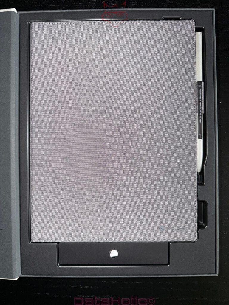
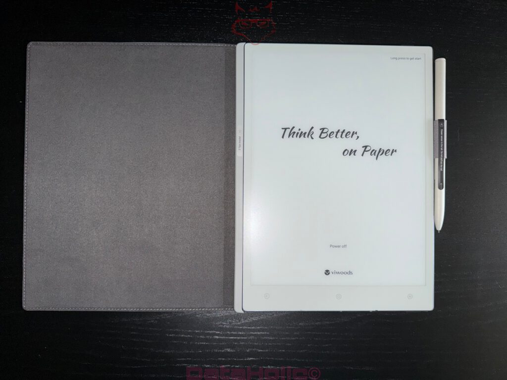
The Cover – Textile Construction With Technical Purpose
One of the first things that stands out when lifting the device is the integrated cover. Unlike many mobile accessories, it does not feel like an optional add-on but rather an integral part of the overall system.
The surface uses a textile-like structure with a lightly rough finish. No glossy coating, no decorative elements, no unnecessary design experiments. Instead, the overall impression resembles functional work equipment.
The construction becomes particularly interesting once its structural rigidity is examined.
The AiPaper sits precisely inside the frame of the cover without visible movement or unstable transitions. Especially with large-format E-Ink devices, this matters enormously because the panel itself reacts sensitively to torsional stress.
The hinge structure intentionally remains simple. That simplicity carries major advantages: fewer mechanical weak points, lower stress on moving parts and improved structural reliability during long-term usage.
Additionally, the cover distributes external pressure more evenly across the rear structure of the device. That reduces stress concentrations on the display and significantly improves transport protection.
Accessories – Reduced to the Essentials
Beneath the device sits the accessory compartment. The included package contents focus entirely on practical components:
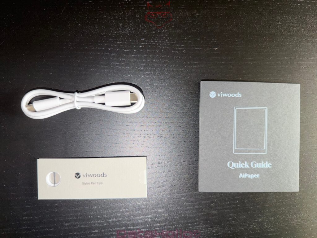
- USB charging cable
- Replacement stylus tips
- Quick-start documentation
Nothing more.
And that reduction fits the product remarkably well.
The accessories do not feel like marketing additions but rather like technical consumables. The replacement stylus tips are particularly interesting.
Many users completely underestimate the importance of such components. In reality, the tip directly determines writing feel, friction behavior and precision. Even minimal differences in material hardness or surface texture noticeably alter the input experience.
Tips that are too hard create an unpleasantly slippery writing sensation. Tips that are too soft wear down rapidly and reduce accuracy.
The fact that Vivwoods includes replacement tips immediately reveals that handwriting functionality sits at the center of the product philosophy.
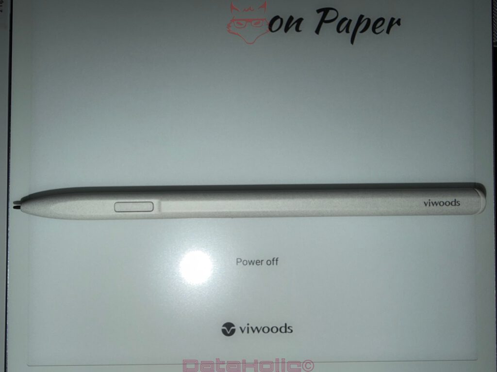
The Stylus – Precision Instead of Theatrics
The stylus itself remains visually restrained. A white body, subtle branding and a single side button define the design.
No futuristic contours. No exaggerated visual elements.
And that is precisely why the stylus feels credible.
From a technical standpoint, the surface material becomes particularly interesting. Instead of glossy plastic, Vivwoods uses a lightly matte coating that reduces fingerprints while improving grip.
The single function button sits relatively flush inside the housing. That reduces the likelihood of unintended activation during longer writing sessions.
The overall geometry of the pen is equally notable. The diameter aligns far more closely with traditional writing instruments than oversized digital pens. As a result, hand posture feels more natural during extended usage.
The magnetic attachment system along the side of the device also feels carefully tuned. The stylus locks securely into place without creating excessive magnetic pressure. Over time, that reduces stress on both the attachment system and the housing structure itself.
The Chassis Construction – Why Structural Stability Matters So Much for E-Paper
A closer examination of the AiPaper quickly reveals that significant engineering effort went into the mechanical construction.
The side structure uses a lightly metallic visual texture with fine surface detailing. This improves not only tactile perception but also the overall structural impression of the device.
Large-format E-Ink hardware faces a very specific challenge: the combination of thin chassis design and expansive display area dramatically increases the risk of structural twisting.
Even minimal torsional forces can transfer stress directly into the sensitive panel assembly. That is exactly why internal reinforcement becomes critically important in devices of this category.
The AiPaper feels remarkably stable in this area. No creaking noises, no visible flexing, no unstable material transitions.
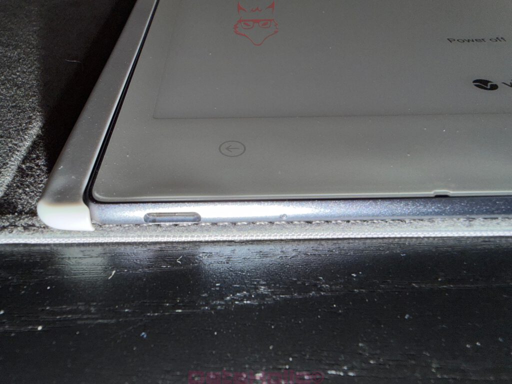
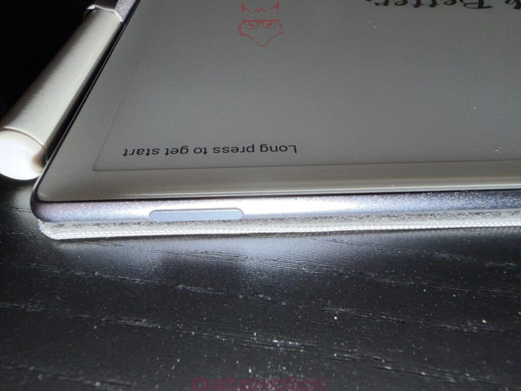
The power button sits flush inside the frame and remains intentionally understated. Here again, the overall design philosophy becomes visible: concentration on functionality rather than visual distraction.
The Display Surface – The True Heart of the AiPaper
The most important technical component of the entire device remains the display surface itself.
E-Ink lives and dies by surface quality.
Not processor performance. Not benchmark scores. Not app ecosystems.
The surface determines whether a digital writing device feels precise, controlled and comfortable during real-world usage.
Vivwoods uses a finely textured coating on the AiPaper specifically designed to create controlled friction resistance. That friction guides the stylus across the panel in a deliberate and highly stable way.
The surface feels intentionally tuned. Not too smooth. Not too rough. That exact balance is technically critical.
Too much resistance would make long writing sessions tiring. Too little resistance would reduce both control and writing precision.
The AiPaper achieves an impressively refined balance between display texture and stylus behavior.
In addition, the matte coating significantly reduces visible reflections. Light scatters evenly across the surface, maintaining stable readability. At the same time, visual clarity remains sharp enough to preserve thin lines and small details accurately.
For handwritten note-taking, that level of visual consistency becomes extremely important because readability directly influences usability.
The Capacitive Controls – Minimal Input With a Functional Approach
Three capacitive symbols sit beneath the display. No physical switches. No mechanical buttons.
That decision also carries clear technical logic.
Mechanical controls require additional openings in the chassis and increase the number of long-term wear points. Capacitive controls reduce that complexity while allowing a calmer front-side design.
The symbols themselves remain subtly integrated and avoid aggressive lighting. As a result, they barely interrupt the visual calmness of the device.
Their positioning is especially interesting. Due to the large display area, the overall impression resembles a digital writing surface rather than conventional mobile entertainment hardware.
That exact feeling runs throughout the entire AiPaper.
Why E-Ink Remains Technically Fascinating
During the unboxing process, one realization inevitably appears: E-Ink still belongs to the most unusual technologies in the modern consumer market.
Conventional displays generate images through active light emission. E-Ink operates completely differently.
Microscopic pigment particles move electrically and then remain in place without requiring constant energy input.
That means:
Power consumption mainly occurs during display updates rather than during static image presentation.
That is precisely why E-Paper devices achieve exceptionally long battery runtimes.
At the same time, the technology carries unique characteristics. Screen refreshes occur more slowly, animations appear more restrained and fast motion is clearly not the focus of the system.
The AiPaper therefore never attempts to become a universal entertainment device. Instead, the hardware concentrates entirely on reading, writing and focused information work.
And that is exactly what makes the device feel technically authentic.
The Rear Side – Functional, Clean and Structurally Consistent
The rear housing remains entirely functional in appearance. White finish, lightly textured surface and carefully integrated certifications define the overall visual impression.
FCC, CE and additional regulatory markings sit discreetly near the lower section without dominating the chassis visually.
Most noticeable is the consistency of the construction itself. No uneven gaps, no visible transition problems, no unstable material areas.
That is particularly important in large-format hardware where manufacturing tolerances become significantly more visible.
The structure feels stable, technically refined and clearly engineered for long-term professional use.
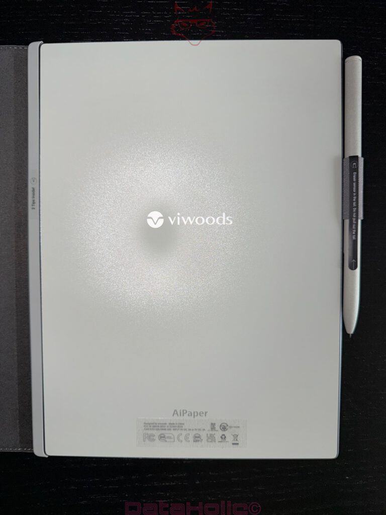
Powering On – The Moment the AiPaper Suddenly Feels Alive
Up to this point, the AiPaper almost feels passive. Only after pressing the power button does the actual transformation begin.
E-Ink possesses a completely unique way of building images.
No instant illumination. No aggressive startup sequence. Instead, the image slowly forms across the panel surface.
Pigments shift position, dark areas gradually emerge and the display almost appears to physically construct itself.
That exact effect gives E-Paper devices their unusual character.
The AiPaper does not feel like ordinary consumer electronics during startup. Instead, it behaves more like a specialized work instrument transitioning into operational mode.
The startup screen remains intentionally restrained. No overloaded animations. No unnecessary effects. Once again, the core philosophy of the device becomes visible: concentration.
Or, as Douglas Adams once essentially described it:
“Technology works best when it is barely noticed as technology at all.”
That exact feeling already emerges during the first technical interaction with the Vivwoods AiPaper.
Transparency Notice According to EU Regulations:
The Vivwoods AiPaper presented in this review was provided to us by Vivwoods as a non-binding loan unit for testing purposes. This does not constitute paid advertising.
Vivwoods had no influence whatsoever on the content, evaluation or editorial independence of this article. All opinions expressed are based exclusively on our own practical experience.
We sincerely thank Vivwoods for providing the review unit and for the trust placed in dataholic.de.