reMarkable Paper Pure in Technical Unboxing: Paper, Plastics, Pen Tips, and the Quiet Discipline of a Digital Notebook
Packaging with a Statement: White on the Outside, Black on the Inside, Focus Everywhere
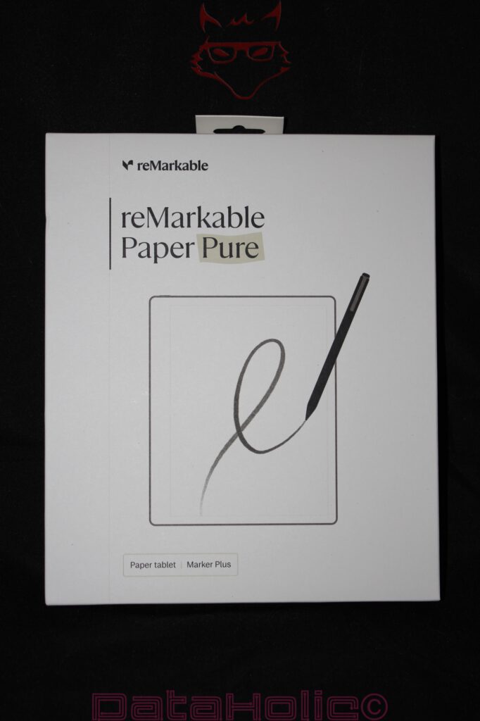
The reMarkable Paper Pure does not arrive on the desk with the gesture of a conventional tablet. No flashy product graphics, no avalanche of specifications on the front, no aggressive promises of performance, no attempt to simulate digital versatility through colors, effects, or printed app icons. The outer packaging remains almost strikingly quiet. A white box, a large product image, the reMarkable logo, the name “reMarkable Paper Pure,” and the subtle note “Paper tablet | Marker Plus.” This packaging requires nothing more, because the product concept itself is built around reduction. A device that promises fewer distractions should not already resemble an overcrowded app store on its packaging.
This sense of calm is the first technical indication. The Paper Pure does not want to be perceived as a tablet in the traditional sense. It does not want to present itself as a media machine, not as a small notebook, not as an e-reader with note-taking functionality, and certainly not as an iPad replacement. It is a digital paper device, and reMarkable carries this positioning through every aspect of the packaging. The front shows the pen in the act of writing, not a user interface. The screen displays no app tiles, but rather a single line. In doing so, the technology explains itself through its most important interaction: tip on surface, movement across the display, friction instead of sliding on glass.
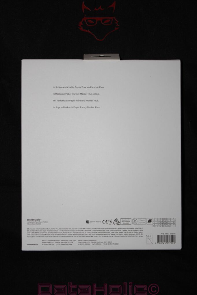
The back of the box remains equally restrained. Multilingual notices, regulatory markings, information about the contents of the package, and model specifications are positioned along the bottom edge. The vast majority of the space remains empty. This emptiness does not feel like cost-cutting but rather like deliberate design. The packaging intends to leave room. This aligns perfectly with a device whose central promise is not excessive performance but concentration. “Better paper. Better thinking.” later appears on the device itself. A phrase that comes dangerously close to marketing language, yet within the context of this product it feels at least understandable: paper here is not merely material, but an interface.
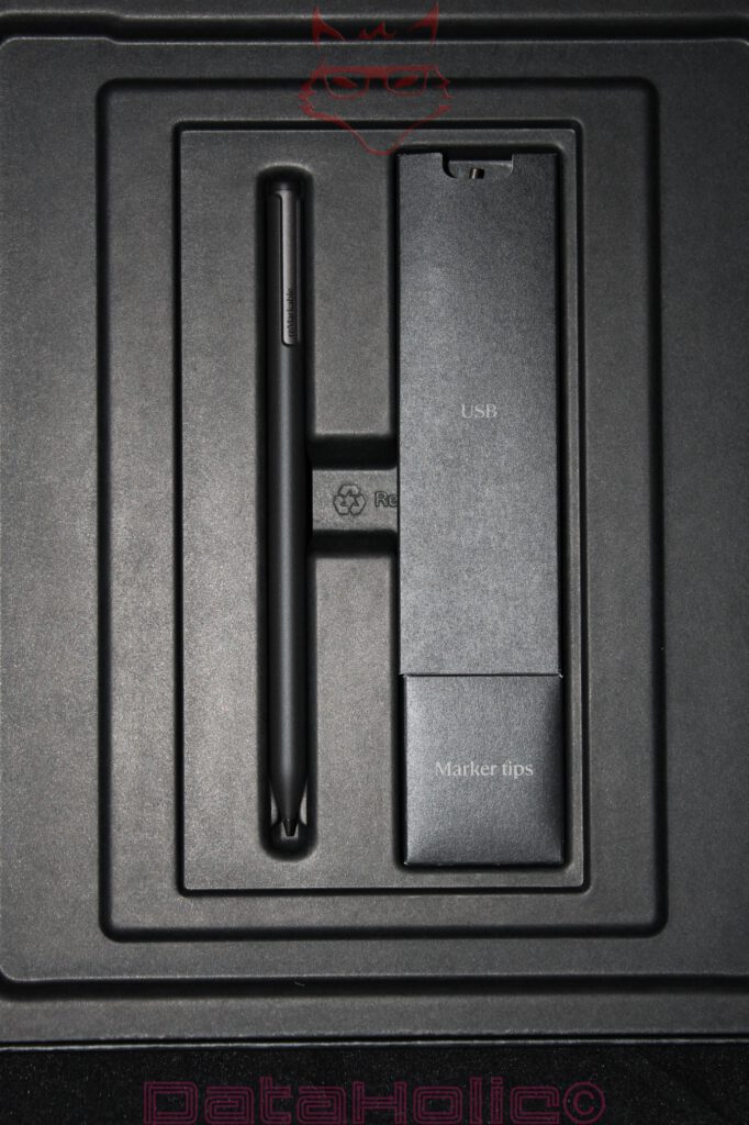
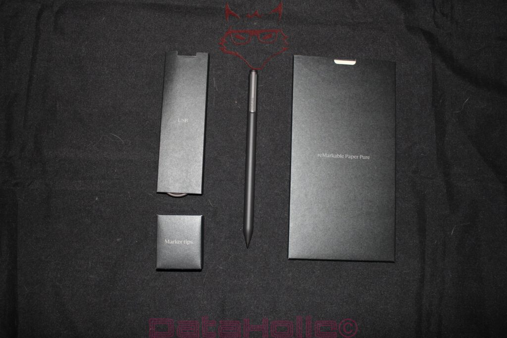
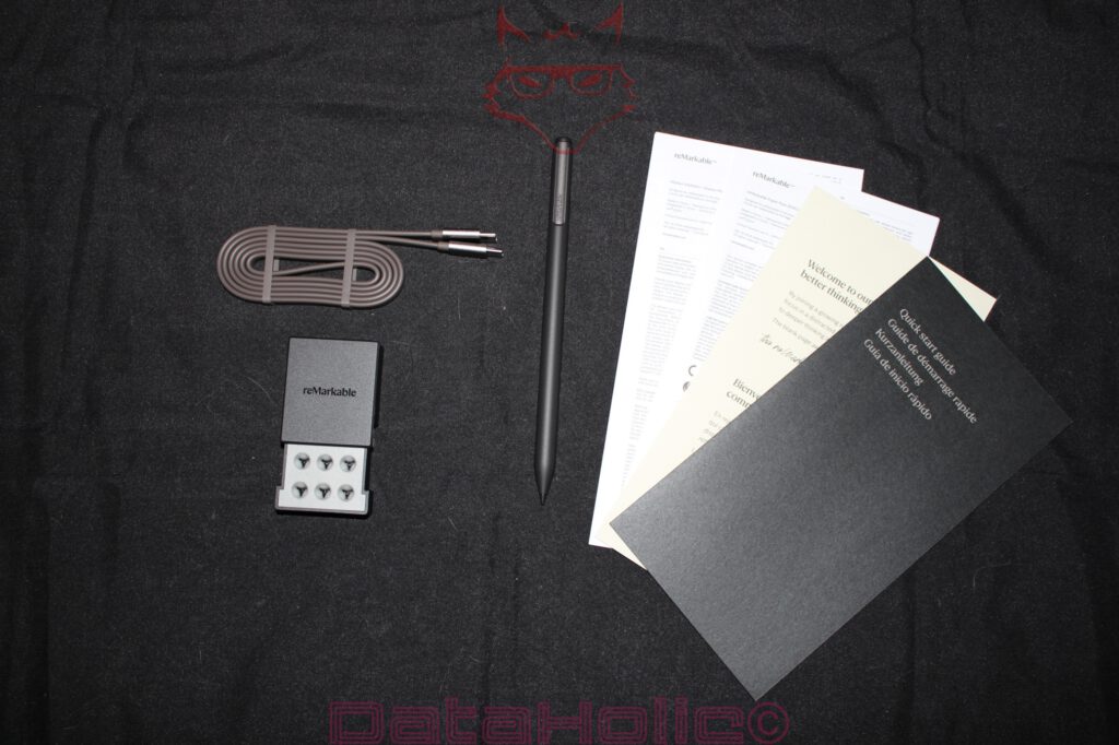
From a technical standpoint, the contents listed on the packaging are already interesting. Alongside the reMarkable Paper Pure, this package includes the Marker Plus. A USB-C cable and six replacement tips are also part of the package. This is important because the pen is not an accessory in the loose sense of the word; it is a functional component of the overall system. Without the pen, the Paper Pure remains a display, but not a writing instrument. Like a fountain pen without a nib or a notebook without pages.
The First Layer: An Inner Box Instead of a Stage Performance
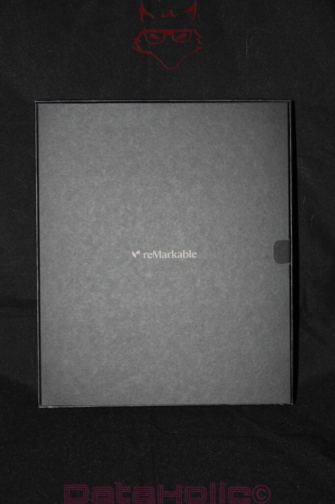
After opening the outer sleeve, a black inner box with a centrally positioned reMarkable logo reveals itself. The transition from white to black is no coincidence. The product appears bright and almost paper-like on the outside. Inside, a calmer and more technical stage emerges. The black box is more reminiscent of premium writing instruments, audio accessories, or camera equipment than traditional consumer electronics. This suits the product concept: the Paper Pure does not wish to be dramatically unboxed but rather methodically unveiled.
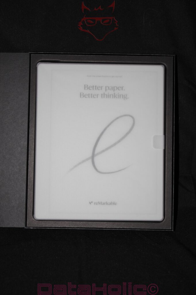
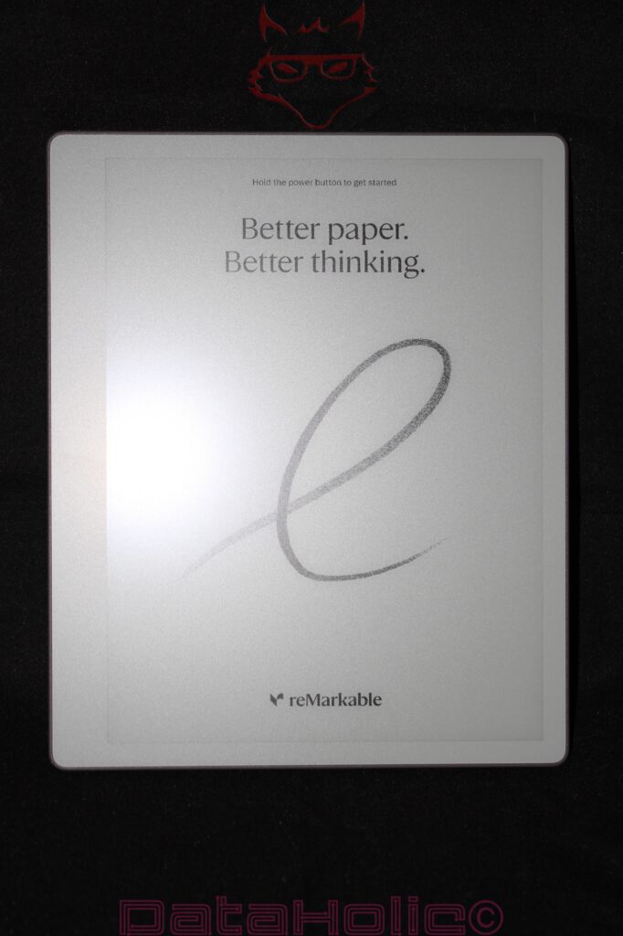
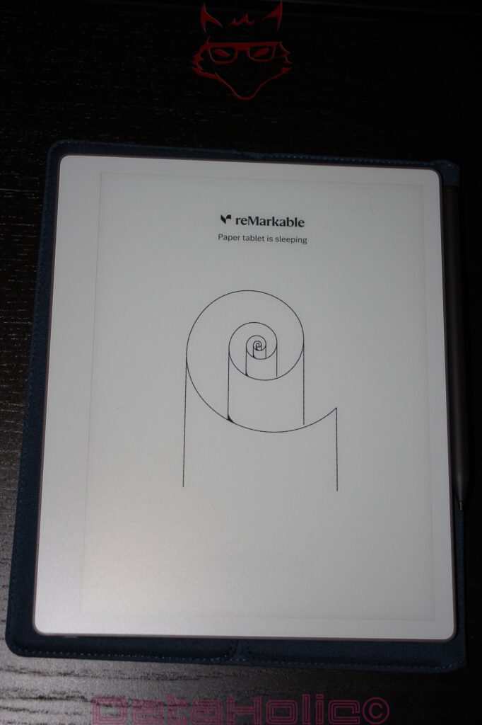
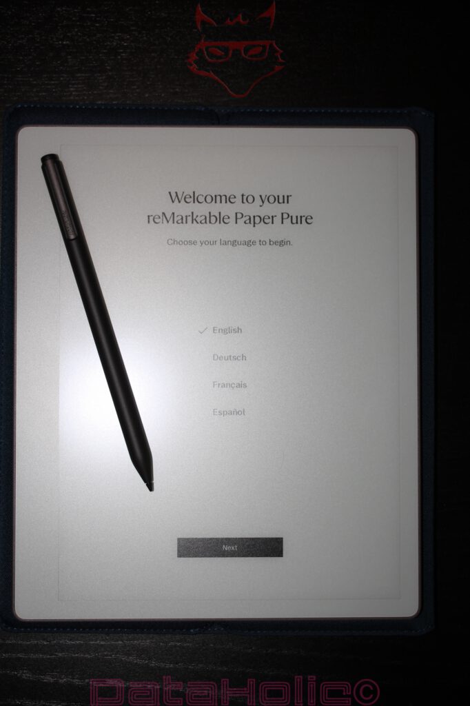
The inner box itself feels sturdy, neatly folded, and precisely assembled. Nothing rattles, nothing sits loosely, and nothing gives the impression of an afterthought regarding accessories. The architecture of the packaging directs attention first to the device itself. The lid opens sideways, revealing the Paper Pure resting within a custom-fitted tray. It is covered by a semi-transparent protective sheet upon which the startup screen is already visible. This decision is remarkable: the device does not present itself as a switched-off black slab but already appears as a readable object even in its dormant state. This is precisely where E Ink demonstrates its distinctive nature. An LCD or OLED display becomes nothing more than a dark rectangle without power. The Paper Pure, by contrast, displays a message before active use even begins.
“Hold the power button to get started” appears at the top, beneath which the phrase “Better paper. Better thinking.” accompanies a grey handwritten line. The effect is simple, yet powerful. The display explains itself through its material quality. The surface does not resemble glass, despite the fact that a technical display layer naturally exists underneath. It appears matte, subdued, and textured. The first impression is shaped not by brightness, but by tactile character.
At this point, a quote from Antoine de Saint-Exupéry comes to mind: “Perfection is achieved, not when there is nothing more to add, but when there is nothing left to take away.” The tension within the Paper Pure lies precisely in this principle. The packaging removes almost everything other devices attempt to sell as an experience. What remains is a device, a pen, a cable, replacement tips, and paper. Digital paper, certainly, but paper in the way it is conceptualized.
The Tablet in Its Protective Bed: Protective Film, Frame, and Initial Material Impressions
The reMarkable Paper Pure rests within a black molded tray that tightly embraces the device. The surrounding edge protects the corners, while a pull tab on the right side facilitates removal. The packaging avoids excessive padding in favor of a clearly structured layout. The tablet sits flat, securely, and without visible movement. Especially in the case of a device featuring a large matte front surface, this type of positioning makes perfect sense. An E Ink writing surface depends on consistency. Scratches, pressure marks, or concentrated force would be considerably more problematic than on an ordinary tablet hidden beneath highly reflective glass.
The Paper Pure itself creates a surprisingly calm first impression. The front is light grey to white, while the bezel surrounding the display remains close in color to the writing surface. This distinguishes the device from many black e-readers or tablets, where screen and frame form sharp visual contrasts. Here, the overall impression resembles that of a digital notebook. The writing area is not emphasized through aggressive framing but rather integrated harmoniously.
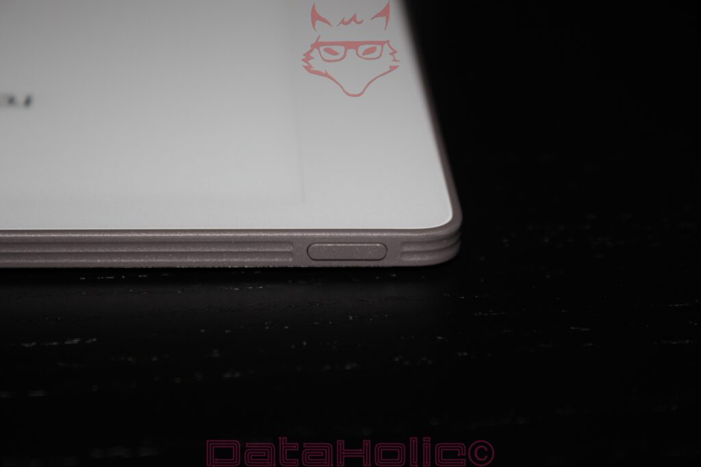
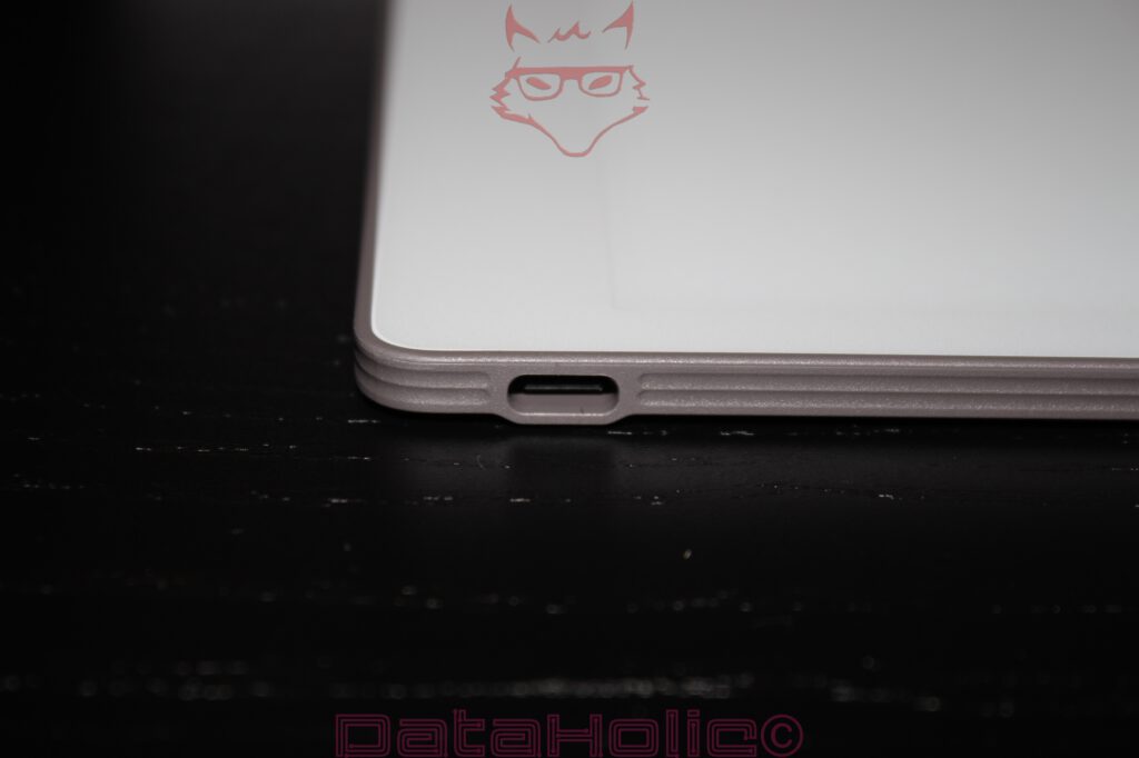
The chassis appears thin without feeling fragile in a nervous way. The edges are softly rounded, while the underside exhibits subtle layering in the material that almost recalls compressed paper or technical ceramics. The USB-C port is positioned centrally along one edge and features a clean cutout. Around the connector, the housing appears slightly reinforced, a sensible decision for a slim device. Charging ports represent mechanical stress points. Frequent insertion, minor misalignment, or tension on the cable all determine whether a thin device merely looks elegant or also proves durable in everyday use.
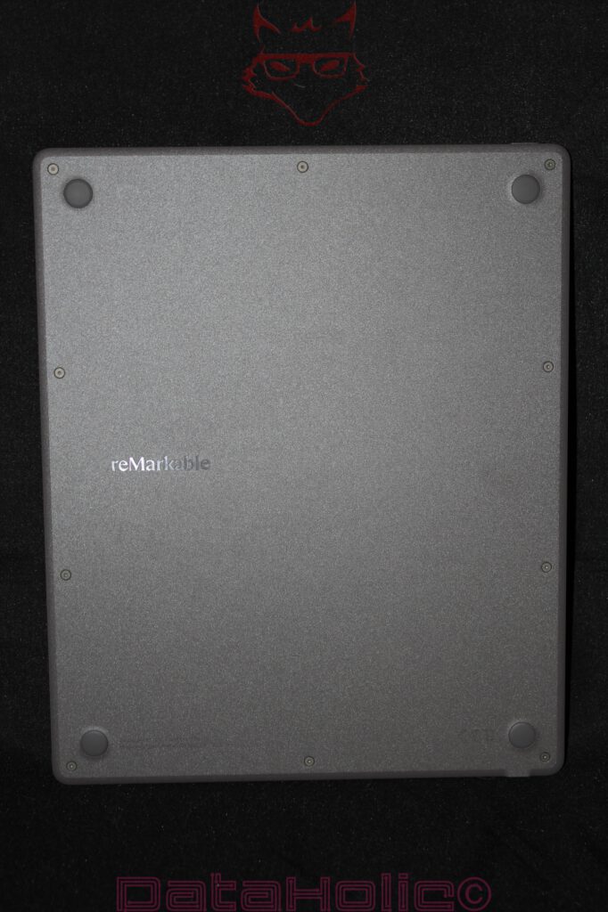
The rear side presents a distinctly more technical character. It appears in dark grey, features a subtle texture, and incorporates visible screws. Four rubberized feet occupy the corners. This backside is not a polished lifestyle surface but rather one that consciously embraces its construction. The screws are not visual flaws but statements. At a time when many tablets are glued together and sealed as disposable sandwiches, the Paper Pure suggests a more repair-friendly direction. This aligns well with reMarkable’s communication regarding replaceable and repairable components. Especially for a device intended as a long-term writing companion, a completely sealed construction would feel contradictory.
The Rear Side and Stability: More Tool Than Ornament
The rear side deserves a closer examination because it reveals a great deal about the character of the Paper Pure. The material does not resemble aluminum but instead feels more like a robust, slightly textured composite plastic. This reduces weight and likely simplifies both repairs and antenna performance. An E Ink tablet does not have to dissipate heat like a high-performance notebook. It requires stability, low weight, strong wireless transmission characteristics, and a surface that does not immediately transform every touch into a collection of fingerprints.
The four rubber feet are positioned with clear functional intent. When writing, the device will usually rest on a desk. Two factors become essential in this situation: it must not slide, and it must not feel hollow or unstable. The feet elevate the rear side slightly above the surface, protecting it from scratches while providing defined contact points. On smooth desks, this becomes especially important because writing pressure creates lateral forces. A digital note-taking device must resemble a paper notebook more closely than a conventional tablet in this regard. An iPad resting on glass or polished wood can easily shift when writing with a rigid stylus. Thanks to its rear construction, the Paper Pure appears more purpose-built for stationary writing scenarios.
The visible screws also represent more than a stylistic choice. They communicate serviceability. A device that can be opened ages differently. Batteries are wear components, and USB-C connectors eventually become wear components as well. For a writing device designed to accompany its owner over many years, this becomes highly relevant. Paper notebooks eventually fill up, while digital devices eventually grow old. The real challenge lies in preventing aging from automatically equating to replacement. Within an industry increasingly obsessed with making products thinner, smoother, and more permanently sealed, the rear side of the Paper Pure feels refreshingly grounded.
A quote by Dieter Rams fits particularly well here: “Good design is as little design as possible.” In the case of the Paper Pure, this philosophy is visible not only on the front but equally on the rear. No decorative patterns, no ornamental lines, no metallic gloss. Only a logo, screws, feet, and texture. Function remains visible without becoming loud.
Marker Plus: The Pen as a Mechanical Counterpart to the Display
Beneath the tablet compartment rests the Marker Plus within its own dedicated recess. Adjacent compartments house the USB cable and replacement Marker tips. The arrangement is orderly and technically logical. The pen is not casually placed somewhere within the package but presented like a precision instrument in its own dedicated slot. This is entirely appropriate, because the Marker Plus represents one of the central components of reMarkable’s writing ecosystem.
The Marker Plus appears longer and more substantial than simple passive plastic styluses. Its matte black finish complements both the inner packaging and the overall technical aesthetic of the device. The pen body is cylindrical without being completely smooth. A flattened section featuring the reMarkable branding simultaneously serves as an orientation aid and likely contributes to magnetic attachment functionality. The tip itself sits securely in place and appears finely guided. At the rear end, an integrated eraser distinguishes the Marker Plus from the standard Marker.
This point deserves emphasis: the Marker Plus is not merely a pointing device. It simulates two familiar tools within a single object: a writing tip at one end and an eraser at the other. This physical separation is often underestimated within digital environments. Software could easily implement erasing through menus, gestures, or mode switches. The Marker Plus instead relies upon a movement deeply ingrained through years of education: turning the pen around, placing the opposite end onto the surface, and erasing. A digital system feels less digital when it connects to analog movement patterns that have existed for decades.
The replacement tips reside within a small box. At first glance, this box appears insignificant, yet it serves as a reminder of the system’s material mechanics. The tips represent consumable components. Rather than relying upon a hard glass tip that glides effortlessly across the surface, reMarkable employs a friction-based interaction between pen tip and display coating. It is precisely this friction that creates the sensation of writing on paper. The trade-off is wear. Similar to pencil lead or fountain pen nibs, the tip becomes part of the writing experience. It is not a defect but an intentionally replaceable component.
USB-C Cable and Accessories: Reduction Without Emptiness
The USB-C cable occupies a slim cardboard compartment labeled simply “USB.” Once removed, it reveals itself as a grey, neatly coiled cable featuring USB-C connectors at both ends. Its length appears to measure approximately one meter. This proves sufficient for use at a desk, alongside a notebook, connected to a charger, or integrated into a docking station, without becoming excessive. No power adapter is included, a reality that has become increasingly common across consumer electronics. Given the device’s low energy requirements and USB-C charging standard, this omission feels understandable, even if a complete charging package would still be appreciated.
The accessory packaging maintains the same restrained tone as the remainder of the presentation. No colorful pouches, no plastic blister packs, no unnecessary theatrics. The Marker tips reside within their own dedicated box. Documentation arrives in a black envelope containing a quick-start guide, warranty information, and safety notices. Here too, the system remains linguistically and visually reduced. reMarkable is selling more than hardware; it is promoting a particular kind of working discipline. That statement may sound dramatic, yet it becomes evident in the details: compartments, envelopes, slim cardboard inserts, and clear labeling.
The package contents therefore feel functionally complete. Tablet, Marker Plus, replacement tips, USB-C cable, and documentation. Nothing more is required to begin using the device. At the same time, a protective cover remains absent unless a folio bundle accompanies the purchase. For a device featuring a matte writing surface, protection during transportation quickly evolves from optional accessory to practical necessity. The unboxing experience makes this abundantly clear: the Paper Pure itself is portable and lightweight, yet its surface deserves safeguarding. A sleeve or folio rapidly transitions from luxury to sensible investment.
A Display Without Spectacle: Why E Ink Unboxes Differently
The display represents the true centerpiece of the Paper Pure, even though it does not dazzle through motion during unboxing. E Ink technology functions differently from LCD or OLED panels. Displayed information remains visible without requiring continuous illumination. Consequently, the Paper Pure can already present a startup message while resting inside its packaging. This characteristic is not merely charming; it is fundamentally aligned with the technology itself. An E Ink device resembles a printed page more closely than a glowing screen.
The Paper Pure employs a 10.3-inch monochrome display, which reMarkable positions as an evolution of its Canvas writing surface. Compared with the reMarkable 2, the manufacturer promises higher contrast, faster responsiveness, and improved battery life. For the purposes of unboxing, however, the exact specifications matter less than the immediate visual impression: the surface appears matte rather than reflective, presenting grayscale tones with a calm, almost paper-like quality. The lowercase “e” visible on the startup screen does not resemble a graphic beneath glass but instead evokes the appearance of a soft pencil mark resting upon a subtly textured surface.
This impression carries significant weight because the Paper Pure is not intended for movies, photographs, or colorful magazines. It deliberately abandons color reproduction and front lighting. As a result, the device remains closer to the concept of a notebook while simultaneously depending upon ambient illumination. Within brightly lit environments, this approach feels entirely logical. Under dim conditions, it immediately becomes clear that the device is not designed for late-night reading in bed. This observation is not a minor footnote but rather a component of the broader product philosophy. Paper does not emit light either. Those who work with paper require illumination. The Paper Pure adopts precisely this logic.
Within this philosophy lies both strength and limitation. The surface appears pleasant, calm, and easy on the eyes. At the same time, poor lighting conditions leave little room for compromise. A Kindle Scribe or another E Ink device equipped with front lighting offers greater flexibility in this regard. The Paper Pure remains more uncompromising. It does not aspire to become an all-purpose solution. Instead, it seeks to become a more focused writing instrument.
Housing Edges, USB-C Port, and Tactile Experience: Thin, Yet Not Fragile
A close examination of the USB-C connector reveals a housing edge that appears technically well executed. The port sits centrally within a small cutout. Fine horizontal lines extend along the edge to both sides, preventing the housing from appearing as a monolithic block and instead lending it the appearance of a layered component. This design choice may be purely aesthetic, yet it harmonizes with the overall material impression of the device. The Paper Pure does not feel like a metal tablet but rather like a technical writing board.
The corners are distinctly rounded. This becomes important in the context of a lightweight device because it is frequently lifted with one hand, rotated, or slipped into bags. Sharp edges would become bothersome far more quickly. At the same time, the rounding does not feel overly softened. The device retains its matter-of-fact character. The bezel surrounding the writing surface is sufficiently wide to allow the hand to rest comfortably without immediately triggering unintended inputs. This aspect proves crucial, especially for digital writing devices. A nearly bezel-free design may appear modern, but it can become impractical during prolonged note-taking sessions. The Paper Pure prioritizes usability over visual spectacle.
The rear side, with its rubber feet and visible screws, reinforces this design philosophy. The device is lightweight enough for travel, yet its construction clearly acknowledges desk-based use. A digital notebook spends much of its life resting on surfaces. It is opened, written upon, set aside, and picked up again. The tactile experience must accommodate this rhythm. During unboxing, the Paper Pure conveys precisely this sense of composure: not a fragile luxury object, but rather a carefully engineered working tool.
Packaging Logic and Sustainability: Less Plastic, More Structure
The relatively small amount of visible plastic waste is striking. The packaging relies heavily upon cardboard, molded inserts, and paper sleeves. This aligns with a brand that strongly defines itself through paper metaphors. Naturally, such a product remains electronic equipment complete with a battery, display, circuit boards, wireless modules, and a globally distributed supply chain. A digital notebook does not automatically become sustainable simply because it replaces paper. Nevertheless, the packaging avoids feeling contradictory to the product’s intended purpose.
The manufacturer highlights the use of recycled materials within the Paper Pure and emphasizes improved repairability. The visible screws reinforce this message. From the perspective of a technical unboxing, this becomes relevant because sustainability is not merely suggested through earthy packaging colors. The construction itself provides supporting evidence. A device whose battery, USB-C connector, or other components may eventually be replaced more easily deserves a different assessment than a permanently sealed unit that requires complete replacement in the event of failure.
The box itself feels premium without becoming excessively luxurious. There is no velvet lining, no elaborate magnetic presentation system, and no heavy plastic trays. The packaging protects, organizes, and stages the experience only to the extent necessary. This approach feels appropriate. Electronic packaging can easily become a performance designed to create a memorable moment that ends up in the recycling bin within minutes. In the case of the Paper Pure, the effort remains controlled. The experience emerges not through packaging theatrics but through the device itself and its distinctive surface.
The Startup Screen as a Promise: “Better Paper. Better Thinking.”
“Better paper. Better thinking.” is a phrase that deserves careful examination. Better paper does not automatically generate better ideas. An expensive pen does not write superior sentences, an elegant desk does not eliminate writer’s block, and an E Ink tablet does not substitute for mental organization. At the same time, the statement is not entirely without substance. Tools shape working habits. A device free from app overload, notifications, browsers, and social media distractions can indeed foster a different kind of environment.
This is where the true technology of the Paper Pure reveals itself, extending beyond the display alone and into the deliberate act of omission. No colorful home screen, no conventional tablet expectations, no visible promise of multitasking. The packaging already communicates this philosophy before the device has even been switched on. The tablet rests inside its box like a notebook, the Marker Plus beside it like a genuine writing instrument. The USB-C port is necessary, but not central. The replacement tips serve as reminders that writing here retains a physical dimension.
A quote from Henry David Thoreau feels remarkably appropriate: “Our inventions are wont to be pretty toys, which distract our attention from serious things.” The Paper Pure attempts to avoid precisely this criticism often directed toward modern technology. Whether it succeeds in everyday life remains a question for later testing. The unboxing, however, demonstrates that the product embraces this idea consistently enough to avoid resembling an ordinary tablet disguised in paper clothing.
Marker Tips: Small Components, Significant Consequences
At first glance, the six replacement tips may seem insignificant. Technically, however, they prove essential. The writing experience of an E Ink notebook arises from the interaction of three elements: display responsiveness, surface friction, and tip material. If the tip is too hard, the result feels smooth and glass-like. If it is too soft, writing becomes imprecise and spongy. If the surface is excessively rough, the tips wear down too quickly. If it is too smooth, the sensation of writing on paper disappears.
The included replacement tips therefore represent more than a thoughtful extra. They are integral parts of the system. Their presence also demonstrates that reMarkable accepts wear as part of the product lifecycle and incorporates it into the overall experience. The small storage box is practical because loose stylus tips have an unfortunate tendency to vanish. Anyone who has searched for tiny adapters, SIM-eject tools, or spare nibs will immediately recognize the importance of orderly storage. The Paper Pure packages its consumable components neatly and visibly.
The Marker Plus introduces an additional advantage: it requires no battery. This reduces maintenance requirements and eliminates the need to charge the stylus itself. A writing instrument demanding separate charging inevitably introduces friction into everyday use. Within the Paper Pure ecosystem, power management remains the responsibility of the tablet. The pen remains permanently ready for use as long as the tip itself remains intact. Once again, this aligns beautifully with the paper metaphor. A pencil does not inquire about battery levels; it merely requires a sharpened tip.
Documentation and Quick Start Guide: Paper Explaining Paper
The documentation arrives inside a black envelope and carries an almost ironic sense of appropriateness: a digital paper device explained through actual paper. Included are multilingual instructions, a quick-start guide, and legal notices. The presentation remains clean, understated, and well organized. No thick manuals, no overwhelming specification tables, and no unnecessary promotional inserts disrupt the experience.
A concise introduction feels entirely appropriate for a device like the Paper Pure. The first meaningful interaction should occur through the pen rather than through a manual. Nevertheless, hardware requires clear instructions: hold the power button, charge the device, pair accessories, observe safety notices, and replace pen tips when necessary. Everything beyond these essentials belongs within the software experience. Since this unboxing deliberately avoids discussions surrounding software, setup procedures, or cloud functionality, the documentation remains what it should be: a practical accessory that fulfills its purpose without demanding attention.
Even so, the physical presentation of these materials remains noteworthy. The sheets themselves are light in color, the envelope black, the pen dark, and the tablet bright. The entire package plays with contrasts: paper and electronics, white and black, textured surfaces and exposed screws, digital storage and analog writing movements. This interplay feels stronger than in many other products, where packaging serves merely as transportation material.
Technical Classification of the Unboxing: Not a Tablet, but a Writing System
The reMarkable Paper Pure makes one thing abundantly clear during the unboxing process: it should not be regarded as a standalone device. It is a writing system consisting of a tablet, a specialized surface, the Marker Plus, replacement tips, and supporting accessories. These individual components interact with one another. The tablet without the Marker loses its essential purpose. The Marker without its corresponding surface would merely be another stylus. The replacement tips would become meaningless spare parts without the wear characteristics that define the writing experience. The USB-C port would be little more than a charging connector if it were not paired with the device’s extended battery life. Together, these elements form a device whose identity arises from careful coordination.
The technical specifications help place this impression into context. The Paper Pure is lightweight, thin, and designed for extended battery endurance. Its monochrome display with a matte surface prioritizes readability and writing comfort. The deliberate absence of color reproduction and front lighting reduces energy consumption and complexity, although it simultaneously limits certain use cases. The rear side, with its exposed screws and rubber feet, suggests practicality and long-term usability. The Marker Plus complements the system through its integrated eraser and enhanced tactile qualities. The included accessories remain minimal but purposeful.
A traditional tablet is often judged according to processor performance, storage capacity, display brightness, and the breadth of its app ecosystem. In the case of the Paper Pure, the criteria shift significantly. Here, factors such as latency, friction, contrast, weight, desk stability, pen balance, tip wear, and housing durability take center stage. The unboxing process highlights these priorities before a single note has been written. This is a device that communicates through its materials and through the deliberate absence of excess.
Sleeve Folio in Technical Unboxing: Somewhere Between Protective Cover, Writing Portfolio, and an Underestimated Everyday Tool
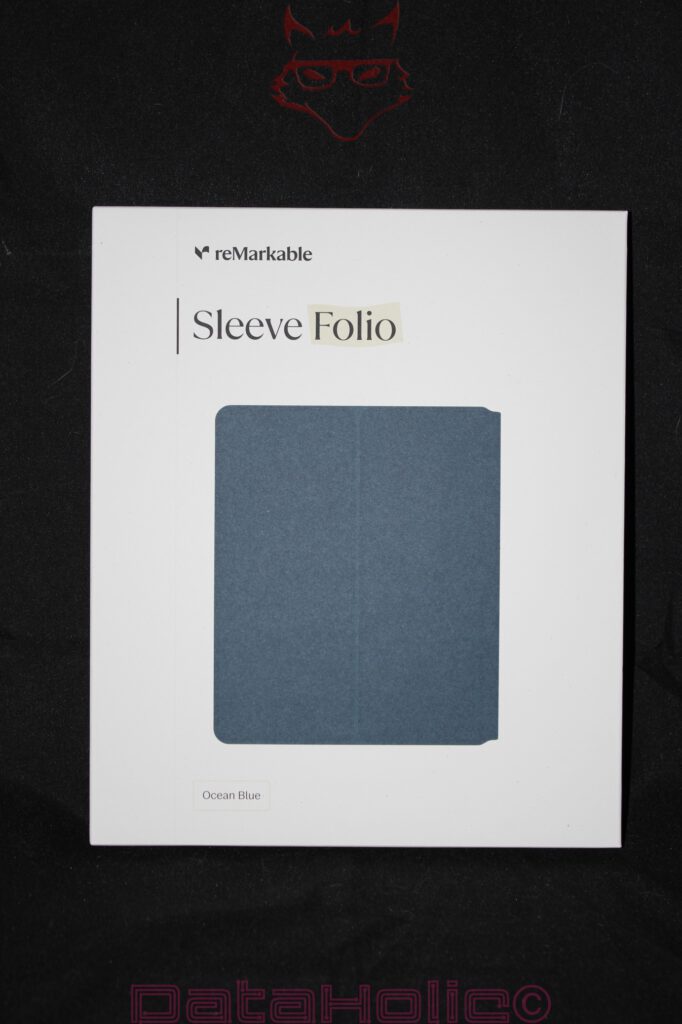
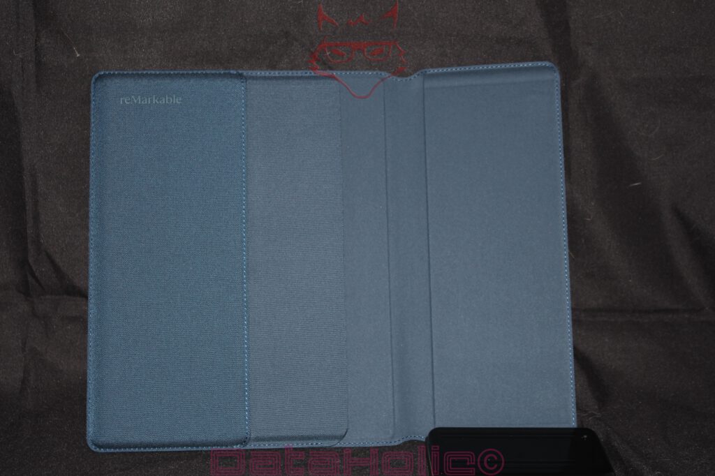
When it comes to accessories, enthusiasm often ends where the actual hardware begins. Protective covers frequently disappear into a single sentence in technical reviews, somewhere between the list of included accessories and pricing considerations. However, the reMarkable Sleeve Folio in Ocean Blue already demonstrates during the unboxing process why this perspective falls short. For a device that deliberately presents itself as digital paper, the cover assumes a different role than it would for conventional tablets. It serves not only as protection but also extends the overall concept of focus, mobility, and a reduced working environment.
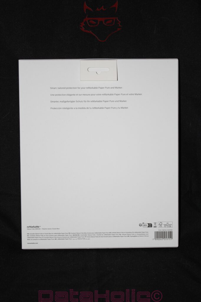
Even the packaging adopts the familiar design language of the Paper Pure. The front remains almost entirely white and displays only the product name “Sleeve Folio,” an image of the cover itself, and the color variant “Ocean Blue.” The rear side avoids exaggerated product descriptions and limits itself to a single sentence: “Smart, tailored protection for your reMarkable Paper Pure and Marker.” Rarely has the purpose of a protective cover been summarized in such a straightforward manner.
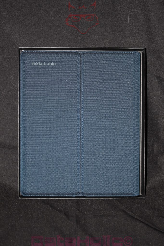
Upon opening the packaging, a folio reveals itself that, at first glance, resembles a high-quality document case rather than typical tablet accessories. The textile outer surface features a fine texture that visually falls somewhere between fabric and technical woven material. The Ocean Blue colorway, in particular, feels pleasantly restrained. No aggressive black, no artificially luxurious leather appearance, but instead a subtle shade of blue that remains equally unobtrusive in everyday work environments, lecture halls, meetings, or train journeys.
The construction becomes truly interesting upon closer inspection. The Sleeve Folio completely dispenses with rigid plastic shells, click mechanisms, or surrounding retaining frames. Instead, the Paper Pure is accommodated through precisely fitted insertion areas. The inner side consists of a softer material intended to protect the matte surface of the E Ink display without applying additional pressure to the writing surface. This point is more important than it may initially appear. While conventional tablets usually rely on durable glass surfaces, the writing experience of the reMarkable derives from its specially developed surface texture. In this context, protection means not only absorbing impacts but equally preventing the smallest scratches and material stress.
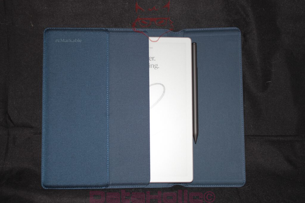
The integration of the Marker Plus proves particularly successful. The pen does not disappear into an additional loop that may deform or stretch over time. Instead, it is elegantly incorporated into the overall geometry and remains accessible at all times. This may sound like a minor detail, yet in daily use it often determines whether the experience feels convenient or frustrating. A writing instrument that first has to be searched for loses part of its spontaneity. The Sleeve Folio reduces precisely these sources of friction.
When opened, the construction almost resembles traditional writing portfolios. The tablet rests securely on the right-hand side, while the left half of the folio provides an additional protective layer. This association is likely intentional. The Paper Pure does not view itself as an entertainment device but rather as a working instrument. The cover consistently supports this self-image.
The quality of the stitching also stands out. The surrounding edges display clean transitions without loose threads or visible material tension. Especially in textile surfaces, the quality of the seams ultimately determines long-term durability. Poor stitching transforms even premium materials into visual weak points within only a few months. In this respect, the Sleeve Folio leaves a significantly better impression.
From a technical perspective, the cover fulfills several tasks simultaneously. It protects the sensitive front of the Paper Pure from mechanical influences, prevents direct contact with other objects inside bags or backpacks, and organizes the tablet and pen as a unified system. Beyond that, it changes the way the device is transported. The Paper Pure on its own feels lightweight, almost delicate. Once placed inside the Sleeve Folio, it conveys the impression of a robust working portfolio.
An interesting detail reveals itself within the material itself. The textile exterior generates considerably more friction than smooth plastic or leather surfaces. This reduces the likelihood of the cover sliding off smooth surfaces. At the same time, it accumulates noticeably fewer fingerprints than many artificial leather alternatives. In return, dust or fine fibers may become more visible over longer periods of use. Once again, the typical balancing act between functionality and maintenance becomes evident.
The true value of the Sleeve Folio only emerges in combination with the Paper Pure. A device that consciously eliminates distractions often reveals its strengths while on the move: during lectures, meetings, in libraries, or throughout extended train journeys. It is precisely in these situations that the quality of the transport solution determines whether a digital notebook truly becomes part of everyday life or remains primarily confined to the home office desk.
A small parallel from the analog world presents itself at this point. Premium fountain pens were transported in cases for decades not because their owners were excessively cautious. Rather, the combination of writing instrument and protective case created a kind of ritual. The object was given a dedicated place. The Sleeve Folio conveys exactly this impression. The Paper Pure does not simply disappear into a random bag alongside charging cables and headphones but instead receives its own clearly defined environment.
As a result, the cover evolves from a simple accessory into a component of the overall system. The Paper Pure provides the digital writing surface, the Marker Plus assumes the role of the tool, and the Sleeve Folio delivers protection and portability. Only through the interaction of these elements does the mobile working environment that reMarkable is clearly pursuing truly emerge.

Ultimately, the greatest strength of the Sleeve Folio lies in its restraint. It does not attempt to force additional functionality upon the user. It integrates neither a keyboard nor a stand mechanism, nor does it introduce unnecessary additional compartments. Instead, it focuses exclusively on exactly what its name promises: protection. Tailored, functional, and free from unnecessary complexity.
It is precisely this reduction that makes the cover noteworthy. At a time when accessories are frequently overloaded with as many functions as possible, the Sleeve Folio serves as a reminder that good design sometimes consists simply of fulfilling a single task exceptionally well. The Paper Pure is intended to capture thoughts. The Sleeve Folio ensures that this tool arrives wherever those thoughts take shape.
Between Notebook and Device: The Quiet Punchline of the Paper Pure
During the unboxing process, the reMarkable Paper Pure is not a device designed to overwhelm through spectacle. Precisely therein lies its underlying strength. It does not attempt to impress through an abundance of accessories. It does not rely upon polished metal surfaces, dazzling displays, or mountains of bundled extras. Instead, it presents a remarkably clear product philosophy: writing should feel technologically supported without becoming technologically dominated.
The packaging guides the user elegantly toward this objective. The white outer carton functions almost like a cover page, while the black inner box evokes the impression of a carefully crafted case. The tablet itself resembles a digital sheet of paper, while the Marker Plus assumes the role of a serious writing instrument. The replacement tips explain the friction-based nature of the writing experience. The USB-C cable represents the product’s contemporary technological aspect. The exposed screws on the rear side speak to construction and maintainability. None of these elements are revolutionary in a loud or disruptive manner. Yet together they form a remarkably coherent whole.
A small anecdote from the history of technology seems particularly fitting here: the pencil survived for centuries not because of its complexity, but because it minimized the distance between thought and line. The Paper Pure attempts to recreate this distance within a digital environment. It is neither a complete replacement for paper nor a tablet designed to do everything. Instead, it emerges as a specialized tool intended for notes, sketches, reading, and thinking in shades of grey. The unboxing process communicates this specialization with impressive clarity.
Preliminary Assessment Without a Verdict: Reduction as Engineering
A final verdict deliberately has no place at this stage. Such conclusions require setup procedures, software evaluation, writing tests, synchronization experiences, PDF handling assessments, battery performance measurements, and prolonged real-world usage. The unboxing alone nevertheless demonstrates that the reMarkable Paper Pure is not simply a device that happens to be minimalist. Its reduction has been engineered. Packaging, materials, display technology, Marker Plus, and accessories all adhere to a unified design language.
The white outer packaging embraces restraint. The black inner box protects while simultaneously presenting the contents. The tablet introduces its E Ink display even while dormant. The Marker Plus occupies its dedicated compartment like a precision instrument. The replacement tips highlight the physical nature of writing. The rear housing, complete with visible screws and rubber feet, reflects technical practicality. The USB-C connector rests neatly within the housing edge, quietly reminding everyone that even digital paper occasionally requires charging.
As a result, the Paper Pure feels less like the latest gadget and more like an object intended for work. It is not a device competing for attention. Rather, it is a device attempting to preserve attention. Significantly, this philosophy begins not after pressing the power button, but from the very moment the box is opened.
Notice in accordance with EU transparency requirements:
The reMarkable Paper Pure presented in this review was provided to us by reMarkable as a non-binding loan unit for testing purposes. This does not constitute paid advertising.
reMarkable had no influence whatsoever over the content, evaluation, or editorial independence of this article. All opinions expressed are based exclusively on our own hands-on experiences.
We would like to sincerely thank reMarkable for providing the Paper Pure and for the trust placed in dataholic.de.